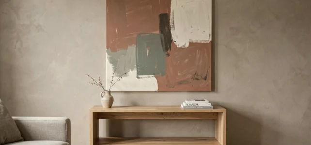
A white wall above a sofa is often the first dead spot you notice when entering a room. Modern wall decoration solves this problem, but it does much more: it structures the space, directs the gaze, and gives an identity to an interior. However, one must know what to place, where, and on what support.
Textured finishes: when the wall itself becomes wall decoration
We first think of hanging something. The current trend leans more towards working on the surface of the wall beforehand. Designers are moving away from classic smooth paint to favor sensory finishes: plaster-effect coatings, fabric panels, grasscloth, or embossed coverings.
The interest is twofold. A textured finish creates depth without cluttering the space. A troweled coating in a terracotta or sage green tone absorbs light differently depending on the time of day, giving the wall a changing character that no frame can reproduce alone.
Specifically, you prepare the support as you would for classic paint (sanding, primer), then apply the coating in crossed passes with a stainless steel trowel. The technique requires a bit of practice, and feedback varies on this point depending on the thickness of the layer and the type of binder. On a unique accent wall (behind a sofa, at the head of a bed), the result transforms the room without touching the rest of the furniture.
To explore different options for materials and finishes suitable for this type of project, useful references can be found at https://www.nouvelle-dimension.fr/, which covers both decorative coverings and technical wall supports.
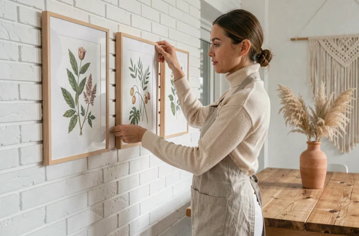
Wall color palette: terracotta, ochre, and deep browns
Cool grays and clinical whites are clearly receding in favor of warm, earthy tones. This shift is not just aesthetic; it alters the perception of the entire room.
Why warm tones work better in interior decoration
An ochre or deep brown wall visually brings the surface closer, creating a feeling of enveloping in a large living room. Conversely, in a small room, a light sage green enlarges without cooling the atmosphere. The operational rule: reserve dark shades for walls you want to bring forward and light tones for surfaces you want to push back.
Combining color and materials
A terracotta wall naturally pairs with raw wood or light oak shelves. Matte black metal (visible fixings, thin frame) creates a sharp contrast without weighing it down. In contrast, an ochre wall with dark wood often produces a monolithic effect that flattens the composition.
- Terracotta + light oak shelves + black metal frames: the trio that works in a south-facing living room.
- Sage green + large neutral-toned canvas + brass mirror: ideal for an entryway or narrow hallway.
- Deep brown + black and white photographs + directional wall sconce: a bedroom accent wall that holds its own without being overloaded.
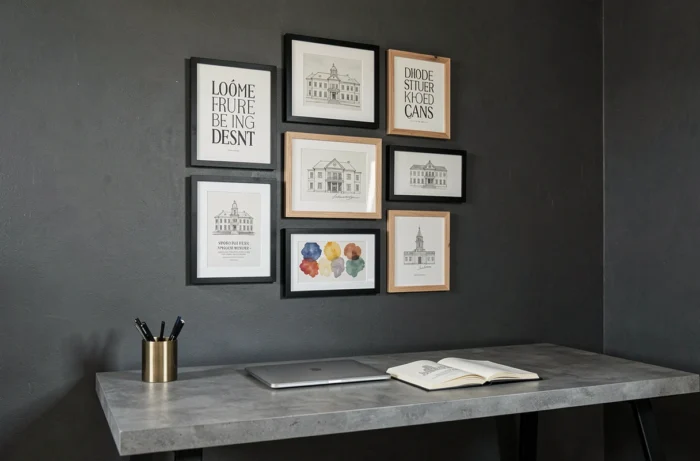
Statement wall: large format versus accumulation of small frames
The trend is moving away from the multiplication of small scattered objects. We now favor “statement” walls, meaning one strong element rather than ten discreet elements. A large canvas, a relief wall panel, or a panoramic wallpaper on an entire wall.
This choice also simplifies installation. A large frame requires two solid fixing points (suitable anchors for the support: drywall, brick, concrete). A gallery of fifteen frames demands a paper template, a laser level, and a lot of patience for a result that can quickly appear cluttered.
When accumulation remains relevant
Intentional maximalism is making a comeback, but in a more composed form than before. We no longer talk about filling a wall randomly. The idea is to layer textures and formats with a compositional logic: a central mirror, two asymmetrical frames, a narrow shelf with a unique object. The common thread can be a color palette (no more than three shades) or a common material (all wood, all metal).
The classic pitfall: mixing too many frame styles. A baroque gold frame next to a brushed aluminum frame creates a visual noise that the brain struggles to organize. Choose one type of frame and stick with it.
Hanging height and lighting: the technical details that change everything
We often hang things too high. The center of a piece or composition should be at eye level for a standing person, which is generally between 145 and 155 cm from the floor. In a living room where people are mainly seated, you should lower it a few centimeters so that the gaze naturally falls on the accent wall from the sofa.
Lighting transforms ordinary wall decoration into a focal point. An adjustable sconce or a track of spotlights placed about thirty centimeters from the wall creates a grazing beam that highlights textures and reliefs. Without dedicated lighting, even a beautiful canvas can go unnoticed in the evening.
- Articulated wall sconce: perfect for a single painting, adjustable according to the frame size.
- Indirect LED strip behind a wall shelf: adds volume to the composition without glare.
- Recessed ceiling spotlight: a discreet solution for an accent wall, provided the wiring is planned in advance.
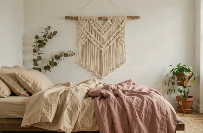
The choice of wall design does not play out in a catalog. It plays out in front of the wall, with a measuring tape, a color sample, and a light source placed in the right spot. Earthy palettes, textured finishes, and large formats provide a solid framework to start, but it’s the on-site adjustment, centimeter by centimeter, that makes the difference between a decorated interior and one that has character.